
Eezylearn School Review Analysis
User Experience
User Interface
Conversion Optimization
SEO
Common Pitfalls
User Experience
What is Responsive Web Design?
A responsive web design will automatically adjust for different screen sizes and viewports.
Cross browser & device testing
Navigation Menu
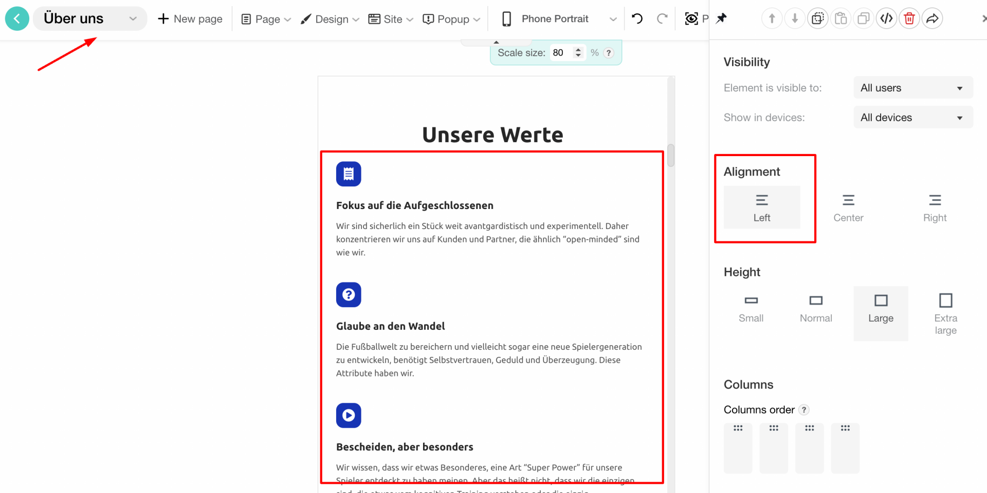
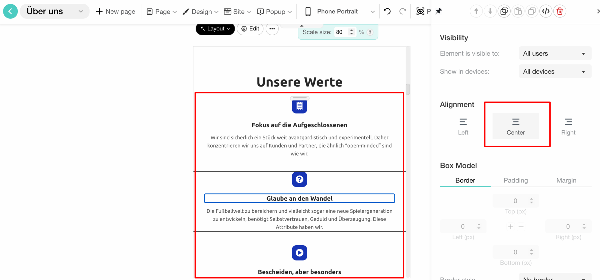
Alignment
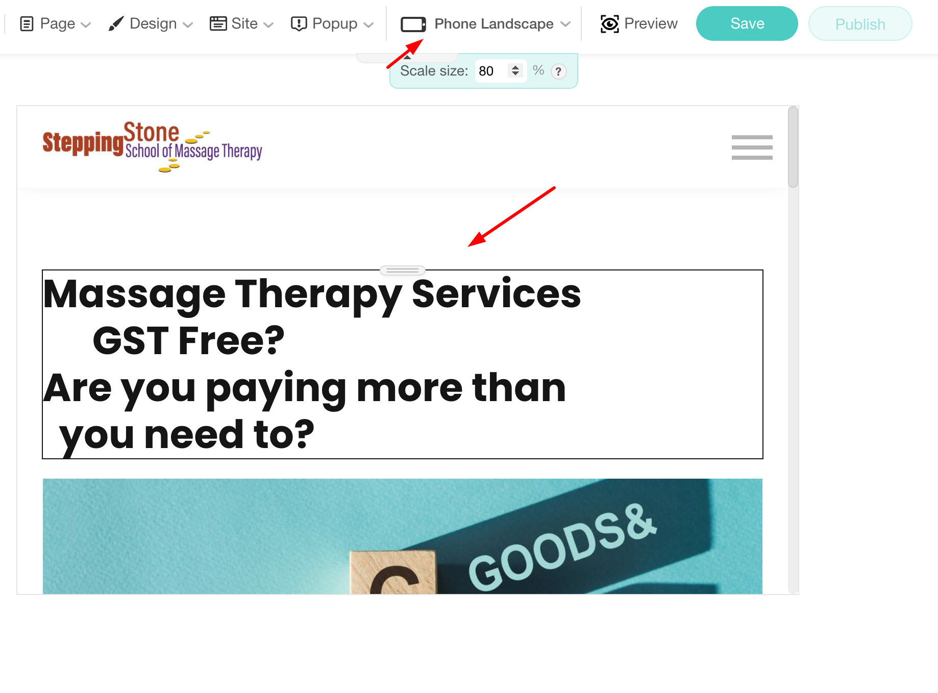
Instructor Led Courses Page
Instructor Led Courses Page
Instructor Led Courses Page
Instructor Led Courses Page
Proper alignment of elements is crucial for creating a visually appealing and user-friendly design. You should keep in mind the below:
Uniform Layouts
Maintain consistent alignment across all pages to create a cohesive look and feel.
Alignment Types
Vertical Alignment: Ensure elements are vertically aligned for a clean and organized appearance. This includes aligning images, text, and buttons within their containers.
Whitespace
Use whitespace effectively to separate content and prevent clutter. Adequate spacing between elements improves readability and focus.
Alignment for Emphasis
Align elements strategically to draw attention to key content, such as aligning a call-to-action button centrally on the page.
Spacing
INFO
- Mobile devices have smaller screens, so using too much space can lead to excessive scrolling and might hide important information below the fold.
- If not balanced correctly, large spaces can make navigation less efficient, causing frustration as users have to scroll more to find the information they need.
Typography
Consistency
Interactivity
Write your awesome label here.
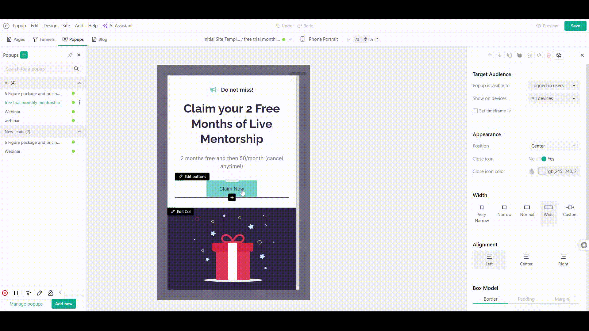
Pop Ups
What is Navigation Flow?
Website Navigation
This mode is offered to test the payment flow & generate sample invoices.
Write your awesome label here.
Sign up with Social Media: It is enabled for all the users
Write your awesome label here.
Write your awesome label here.
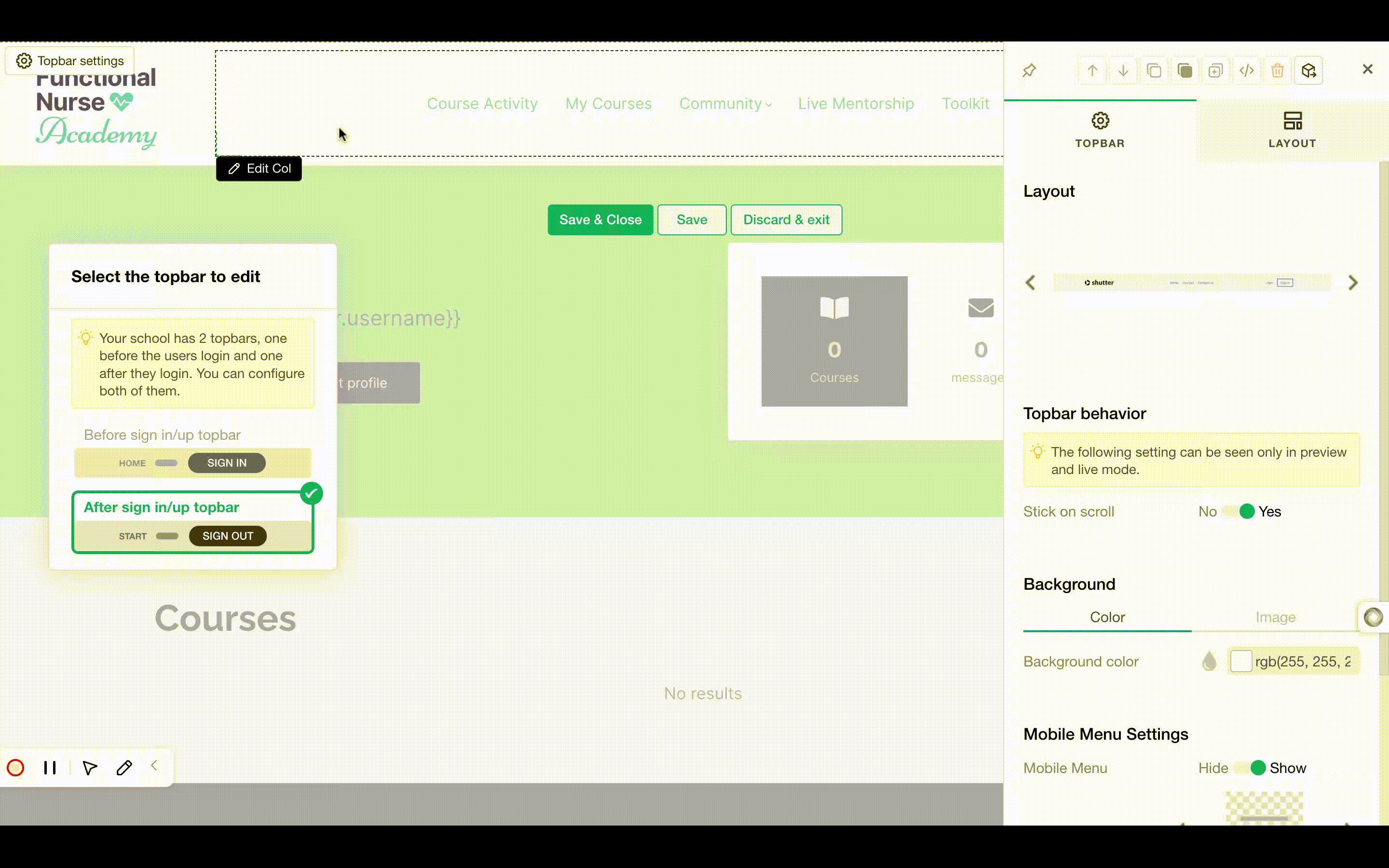
- The Profile page is added twice in the After sign in/up topbar
- Some of the Apps are not in the topbar as menu item → Daily News
Write your awesome label here.
Stands Out
Link Labels
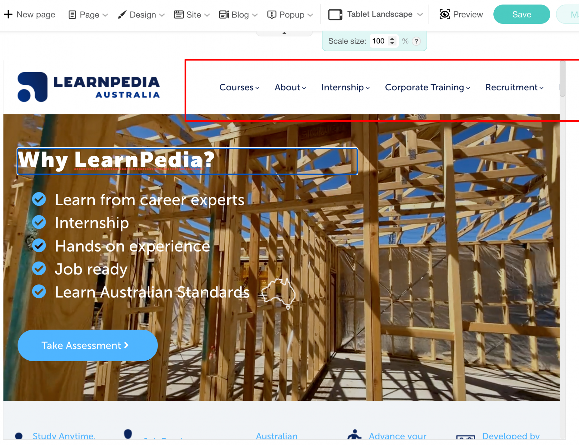
Topbar
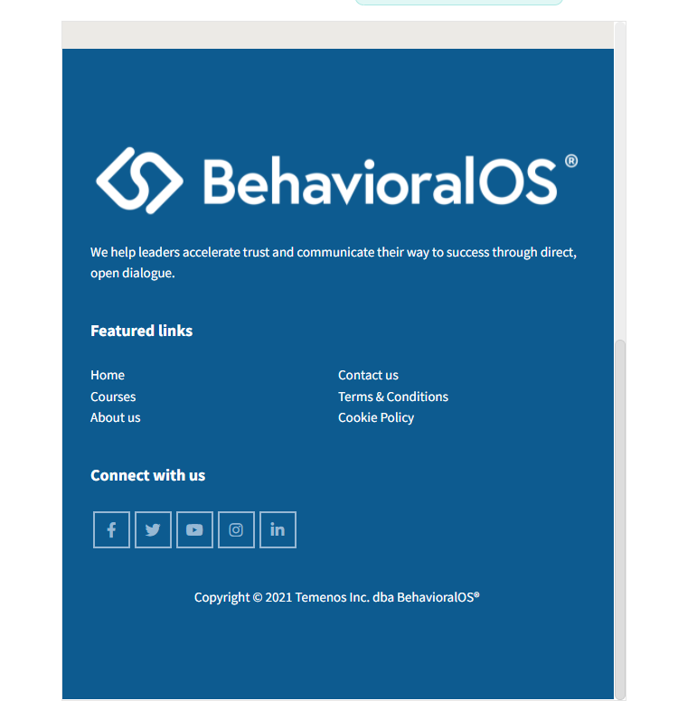
Footer
- Your Logo
- Your contact details
- Policy Pages links
- Contact Details
- Social Media links
- Menu Links, for example Blog page, LMS page
Dead Ends
Interactive Links
Sticky menu
Order of navigation items
What is Performance?
Speed Test
The most important thing to improve the speed of the site is the image optimization.
Write your awesome label here.
Forms
Write your awesome label here.
Write your awesome label here.
Internal Links
Click on the button for more details.
External Links
Images Quality
Contact
Write your awesome label here.
Write your awesome label here.
Non-Used Pages
The small red circle indicates the draft pages.
Check that all the pages that are necessary for your school are public and not in draft mode.
Write your awesome label here.
User Interface
What is Web Design?
Typography
CHECKING THE SIZE AND THE STYLE OF THE HEADINGS.
The size of your headings is correct. They stand out from the rest of the content, making it easy for users to navigate and understand the structure of your page.
Suggestions for font sizes:
- Main Title (H1): 28px to 48px
Should be bold and attention-grabbing. Adjust based on the importance of the page or section. - Subtitles (H2): 24px to 36px
Prominent but slightly smaller than the main title. - Section Headings (H3): 20px to 28px
Distinguishes smaller sections; use for secondary hierarchy. - Subheadings (H4–H5): 16px to 24px
- Primary Body Text: 14px to 18px
Use for general content. Choose a size that ensures readability across devices.
How to combine them
If these feel too busy together, consider replacing Spartan or Raleway with a simpler font, as both have strong personalities that may overlap with the others.
Write your awesome label here.
View the images for more details →
A good color contrast on your school, ensures that the text is easily readable by everyone.
Write your awesome label here.
Write your awesome label here.
Write your awesome label here.
Write your awesome label here.
Colors
Vibrant Blue: Best used sparingly for emphasis—such as buttons, links, or key action areas. It draws attention but can overwhelm if overused.
Write your awesome label here.
Write your awesome label here.
Here are some important considerations to keep in mind when selecting a color palette:
Branding and Identity: Consider the school's branding and identity. The colors you choose should align with the school's logo and other branding elements to create a consistent and cohesive look. Your school's logo has the same color as your headings, and there is consistency in your school's color palette.
Accessibility and Readability: Prioritize accessibility by selecting colors that have enough contrast for easy reading. Ensure that text and important content stand out clearly against the background colors. According to WCAG, text has the right contrast ratio and your school follows the web accessibility rules.
Psychology of Colors: Different colors evoke different emotions and associations. Consider the psychological impact of colors on your target audience.
60–30–10 Rule: The 60–30–10 rule is a popular color theory used by designers to create a balanced and harmonious color scheme. The rule states that a color scheme should consist of three colors in the following proportions: 60% of the dominant color 30% of the secondary color 10% of the accent color.
Spacing
Write your awesome label here.
Write your awesome label here.
Background
INFO
- Readability: Text must be easily readable against the background color.
- Primary vs. Secondary Backgrounds: Use a primary background color for most of the content, in your case white color, and a secondary color for sections that need to stand out.
- Consistency: Apply background colors consistently to avoid visual confusion and maintain a clean design.
- Brand Colors: Ensure that the background colors align with your brand's color palette and overall aesthetic.
- Cohesion: All colors used should complement each other and contribute to a cohesive design.
- Subtlety: If using patterns or textures, ensure they are subtle enough not to interfere with text readability.
- Clarity: Avoid busy or highly detailed backgrounds that can distract from the main content.
Readability
Alignment
Click on the button for more suggestions.
Proper alignment of elements is crucial for creating a visually appealing and user-friendly design. You should keep in mind the below:
Uniform Layouts
Maintain consistent alignment across all pages to create a cohesive look and feel.
Alignment Types
Vertical Alignment: Ensure elements are vertically aligned for a clean and organized appearance. This includes aligning images, text, and buttons within their containers.
Whitespace
Use whitespace effectively to separate content and prevent clutter. Adequate spacing between elements improves readability and focus.
Alignment for Emphasis
Align elements strategically to draw attention to key content, such as aligning a call-to-action button centrally on the page.
Visual cues for separating elements
Links
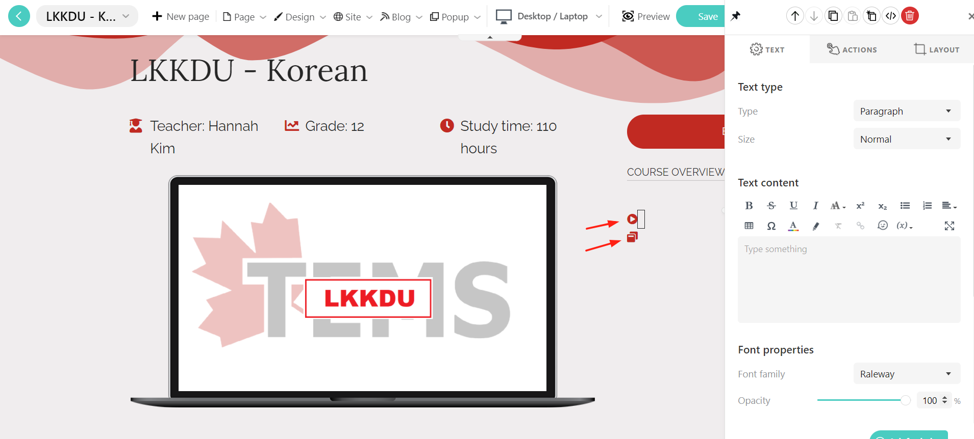
Instructor Led Courses Page
Images
Instructor Led Courses Page
Logo & Favicon
Logo appears in emails, video watermarks and in social media sharing.
Favicons are most often found in the address bar of your web browser.
Sign In / Sign Up Pages
Write your awesome label here.
What is Web Content?
Large Content
Make sure you don't have too many sections on each page. Many users will not scroll to the bottom of the page.
Your content should be concise and you can use bulleted lists to make important information pop out.
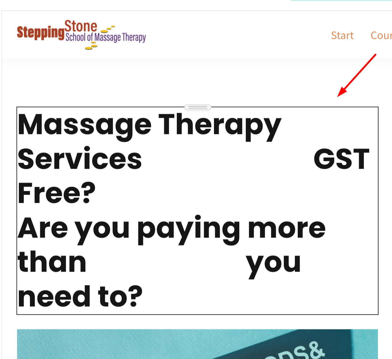
Headings
- Hierarchy: Use headings in a logical hierarchy to structure content. H1 large r normal, should typically be used for the main page title, followed by H2 for section titles, and so on. Use larger font sizes and bold styling for main headings to distinguish them from subheadings. This helps users scan and understand the content hierarchy easily.
- Consistency: Maintain consistent styling (font size, weight, color) for headings throughout the website. This helps users quickly recognize different sections and navigate the content.
- SEO: Optimize headings with relevant keywords to improve search engine visibility. Ensure each heading accurately reflects the content that follows it.
- Accessibility: Ensure headings are descriptive and provide context. Screen readers rely on heading structure to navigate content, so use them appropriately and in sequential order.
Dead Links
Social Media
Write your awesome label here.
Policy Pages
- Cookie policy
- Privacy
- Terms & Conditions
Contact Page
Including multiple contact options helps improve communication and adds a sense of reliability and accessibility to your site.
Write your awesome label here.
Course Pages
Course Content
Forms
Write your awesome label here.
Embed Widgets
Conversion Optimization
Distracting Elements
Calls to Actions
Contact Details
Testimonials
You could try adding some more since testimonials provide social proof, showcasing the positive experiences of past or current students. This builds trust and credibility.
Write your awesome label here.
SEO
SEO Title and Description
Description → Short summary of the page content. The more relevant the description is, the more likely a user will visit the page.
To ensure consistency and optimize your site's visibility, all pages should have a complete SEO title, description, image, and relevant keywords.
Write your awesome label here.
Heading (H1 - H6)
On some pages, you use more than one H1 tag while on others you don't use one at all. It's recommended to use a single H1 tag per page to ensure better SEO and accessibility. Multiple H1 tags can confuse search engines and may affect the page's ranking. Consider restructuring your headings, using H2 or H3 tags for subheadings, to maintain a clear hierarchy and improve the overall organization of your content.
Write your awesome label here.
Write your awesome label here.
You are using H1 for some of your secondary titles. Your secondary titles should be H2.
Instead of using multiple H1 tags, you can use more H2 tags. This will help maintain a clear content hierarchy, improving both SEO and readability. H2 tags are ideal for subheadings, as they allow for better organization of content while ensuring that the primary focus of the page remains clear to both users and search engines.
Write your awesome label here.
Actual Text
Image Alt Text
Write your awesome label here.
Keywords
Keywords are important because they tell search engines about the content of your website's page. “Keyword” is also a term that's used to refer to the words and phrases that people enter into a search engine to find information that they're looking for.
Slugs
Common Pitfalls
You can see more details below.
Misspelled Content
Notification emails
Course Units
General Suggestions
Image Optimization
Internal / External Links
General suggestions
Home page
LMS page
Course pages
Blank pages
All pages
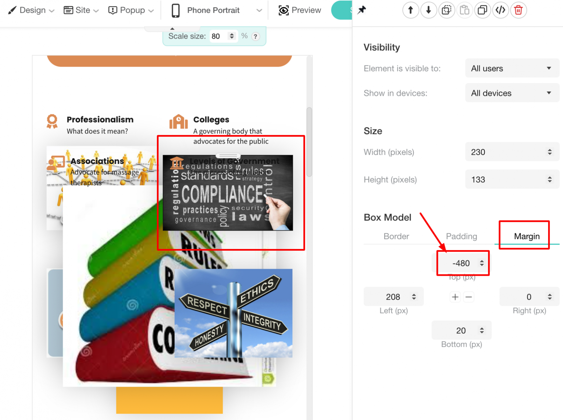
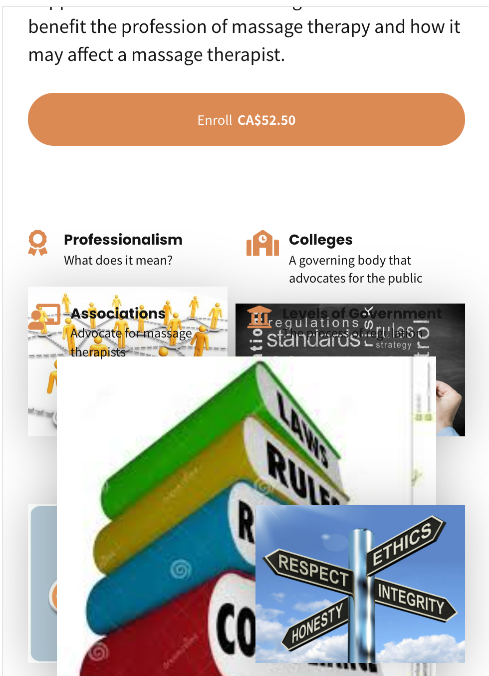
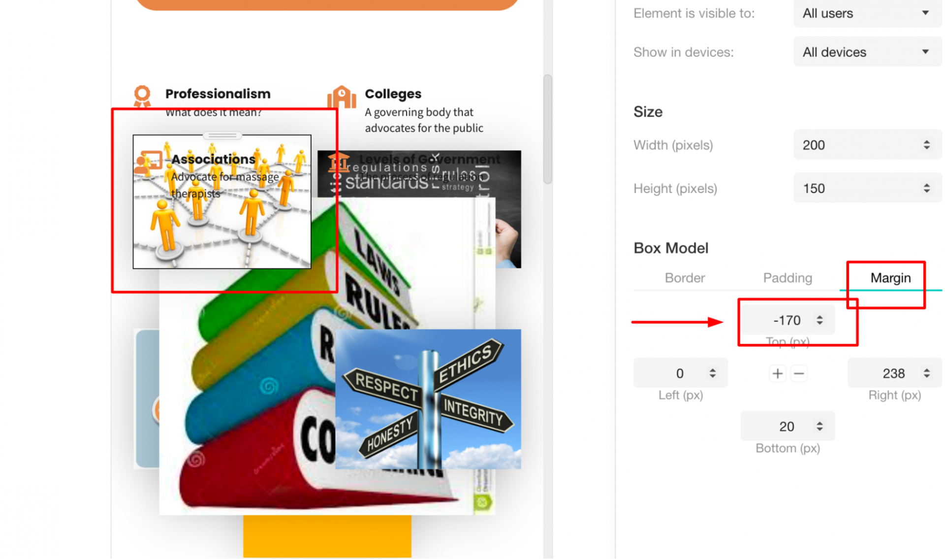
Alignment of elements
Course pages
Spacing between elements - Responsive
Empty Widgets
Actual Text - Steps
Step 1:
Step 2:
Step 3:
Step 4:
Choose the font family you prefer and you will have really achieved the same result.
Image Alt Text
Dead Links
Draft & Empty Pages
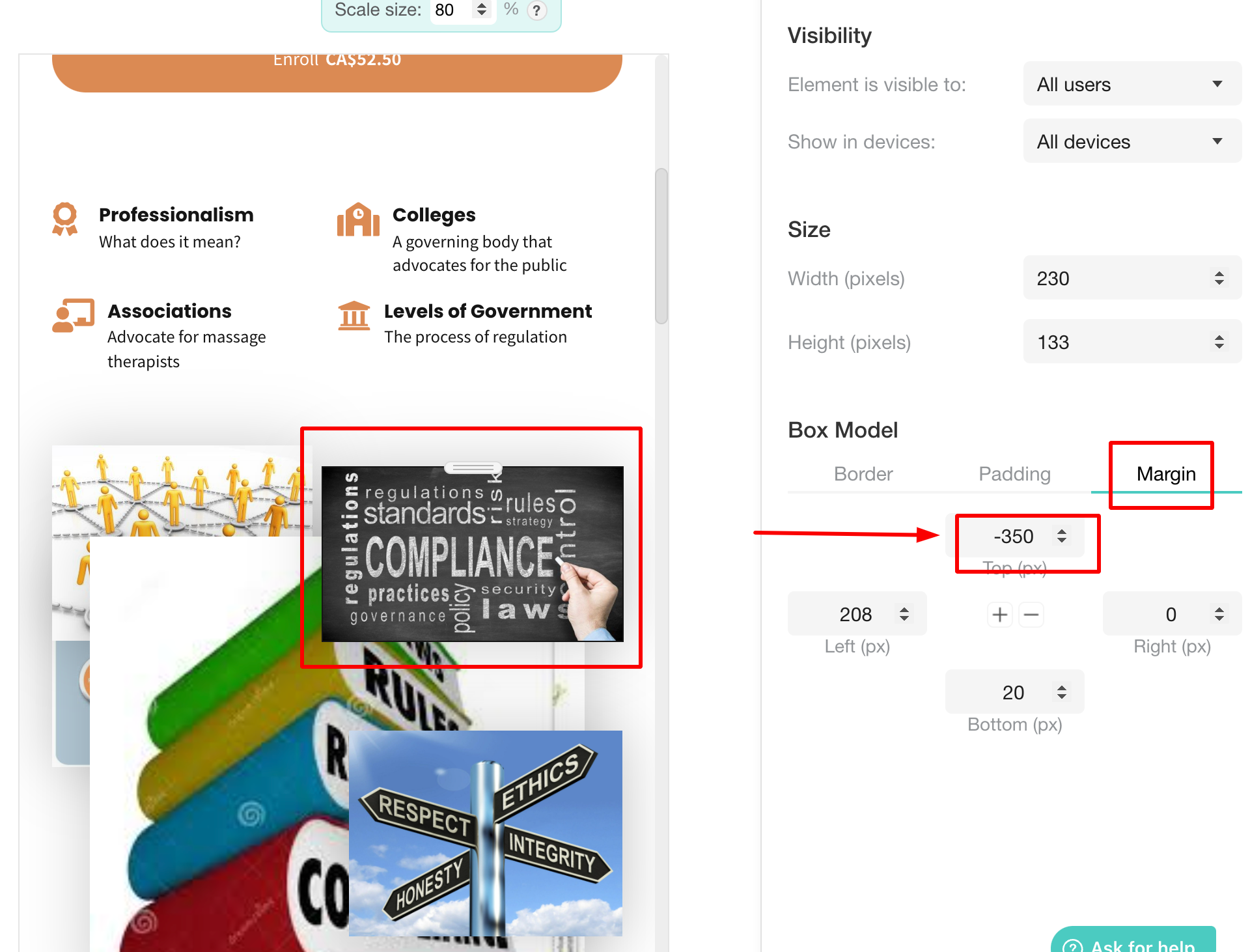
Negative Margins
Alt Text
Dead Links
Background
Responsive - Background
This happens because you have set the background color as white on each column.
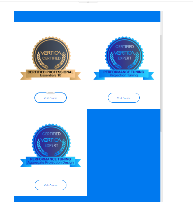
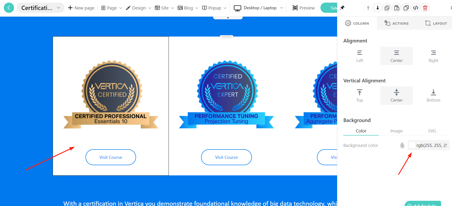
Course Cards - Grid
CTA Design
Also, the label in the button matters. We suggest adding a phrase that would force the users to click the button
Also, the label in the button matters. We suggest adding a phrase that would force the users to click the button
Draft & Empty Pages
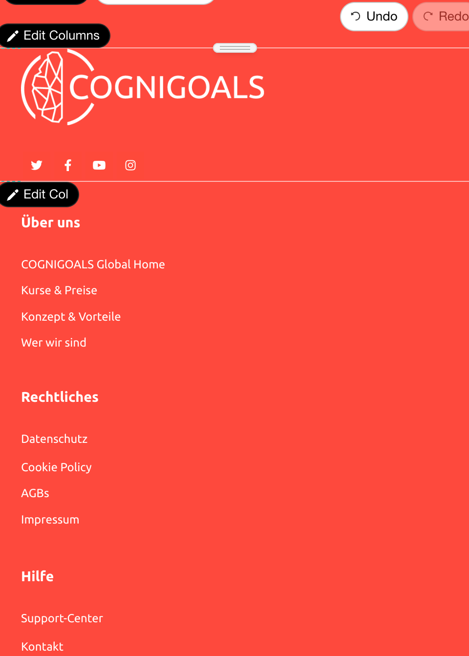
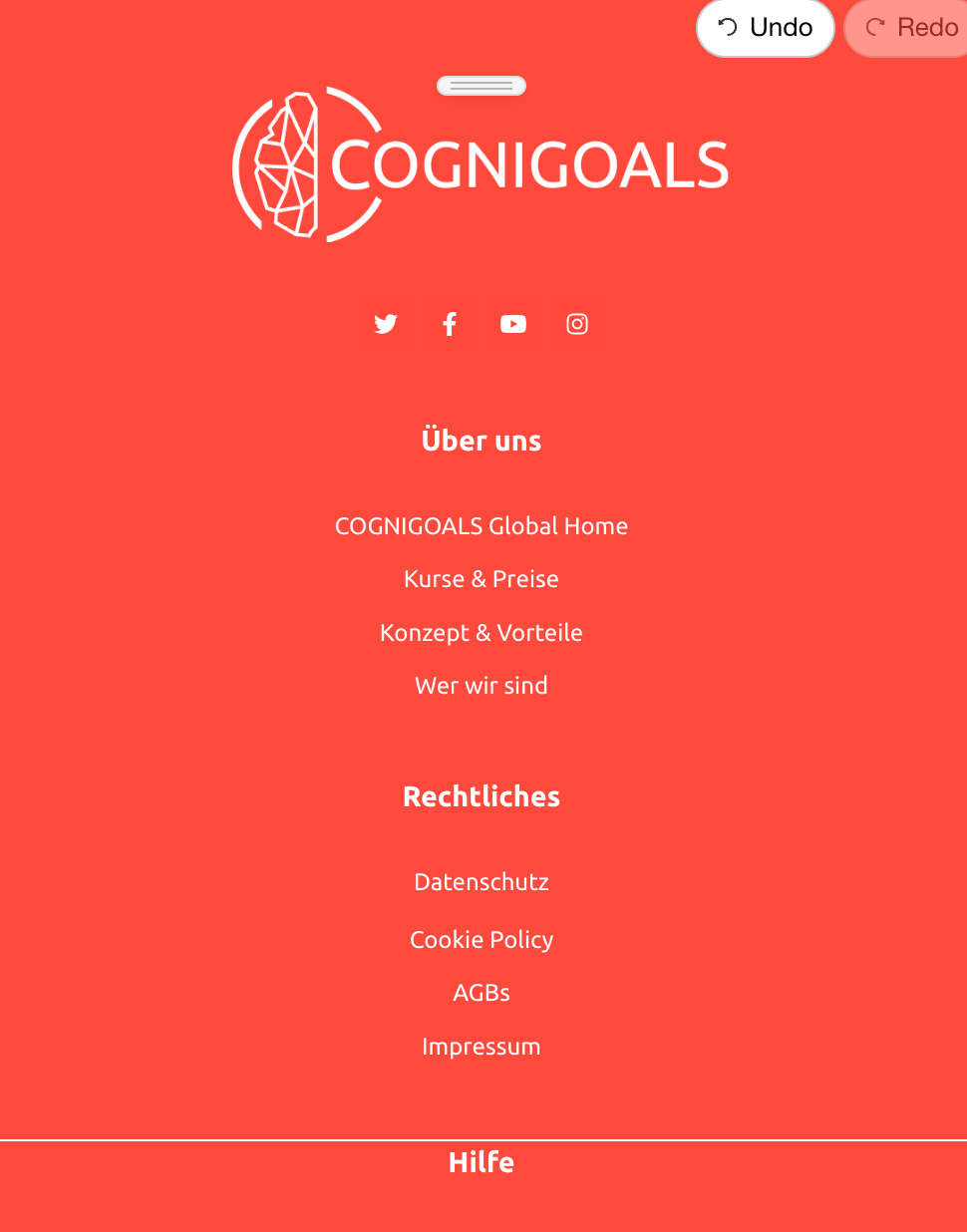
Footer - Responsive - Alignment
The columns are not aligned correctly. You can see more details below.
Write your awesome label here.
Write your awesome label here.
Write your awesome label here.
Write your awesome label here.
Contact Page
Dead Links
Footer - Alignment on Small Screens
BEFORE
AFTER
Footer - Alignment on Small Screens
It’s more preferable on mobile devices.
BEFORE
AFTER
Text Alignment
BEFORE THE RIGHT ALIGNMENT
AFTER THE RIGHT ALIGNMENT
Background
You should add more opacity in your background
BEFORE
AFTER
Readability
Home Page
About Page
Spacing - Paddings
The paddings give “air” in the design and make it look more “clean”.
Responsive - Spacing
BEFORE
AFTER
Custom Sign Up Fields
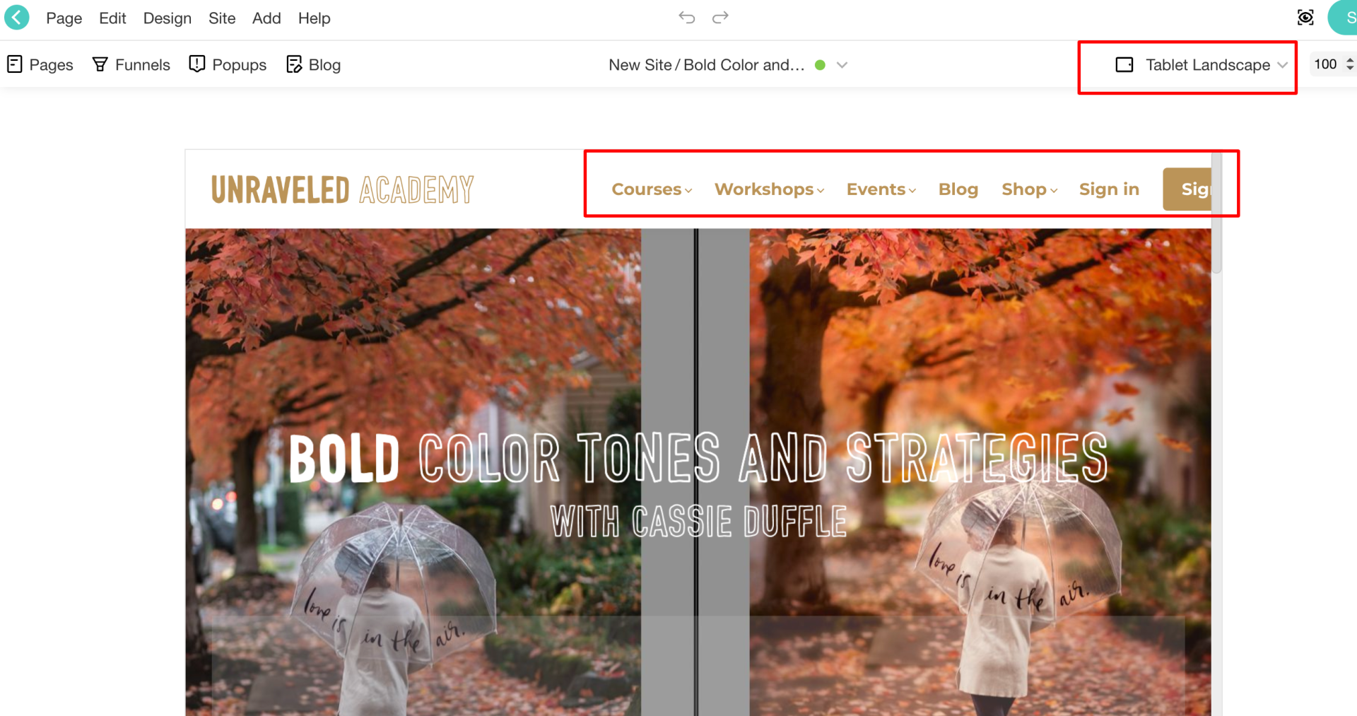
Topbar - Responsive
Step 1:
Step 2:
Step 3:
Alignment - Responsive
You can see below two gifs with before and after making changes on small screens.
BEFORE
AFTER
Contact Page
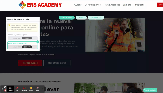
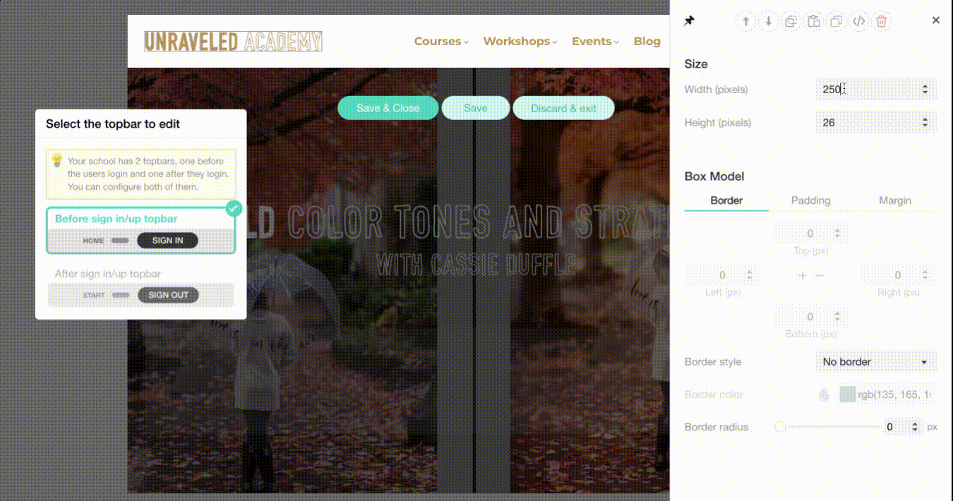
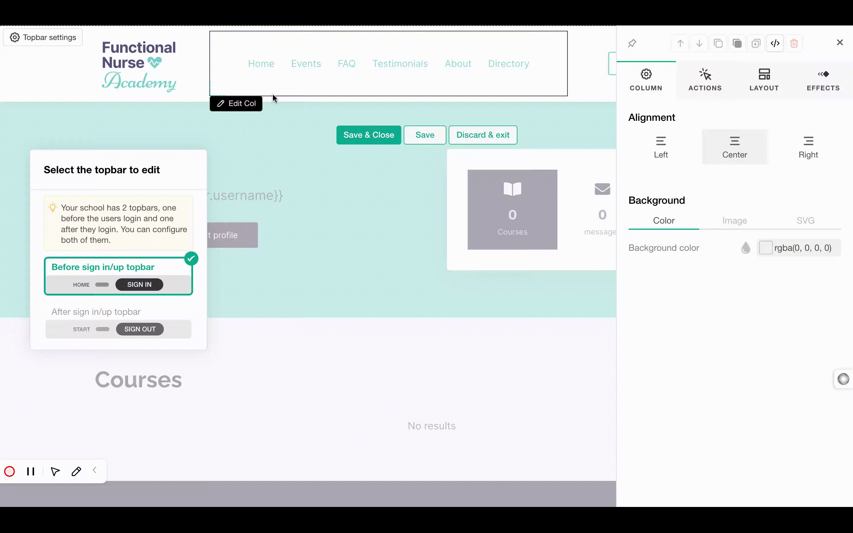
Before sign in/up topbar
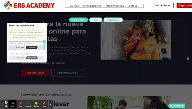
After sign in/up topbar
Alignment - Responsive
We suggest that you set the alignment of the social icons to the left for better consistency.
Contact Page
Phone
Spacing
Negative Margins
Full-Width Buttons
Spacing
Landing Page
Please make sure that you add some buttons that can help the users sign up and check your courses.
Email Section
Before
After
Start now section
In this case, we lead the user to sign up in your school
Alignment
Before sign in/up topbar
Step 1:
Write your awesome label here.
Write your awesome label here.
Step 2:
Step 3:
Write your awesome label here.
Write your awesome label here.
Step 4:
Alignment - Footer - Small Screens
Step 1:
Write your awesome label here.
Write your awesome label here.
Step 2:
Buttons and Links
Home page
We suggest you add a sign up button that is visible to logged out users and you could keep the previous button (VIEW ALL PROGRAMMES) for the logged in users. Please make sure that you add some buttons that can help the users sign up and check your courses.
Events Page
Course Pages
1-click-sales Page
Home old Page
Premium Overview Page
Professional Overview Page
Readability
Home Page
Course Pages
About Page
Premium Overview Page
Bundle Page
Affiliate registration Page
Pricing Page
Events Page
1-click sales
People & Purpose Course
Dead Links
1-click-sales
Contact Page
Premium Overview Page
Events Page
Communication and awareness Course
Community building Course
Alignment
Spacing
Topbar - Responsive
Alignment - Responsive
Below you can see some examples, which we found in your school's pages.
Check your school and make sure there is consistency in alignment.
Footer Before
Footer After
Before sign in/up topbar
Draft & Empty Pages
Background
Dead Links
Alt Text
After login menu links
- Reducing the font size of the menu links
- Reducing the spacing between the menu links
- Reducing the letter spacing to 1
- Add some menu items, as submenu items to save space
- Change the width of the logo
- Remove paddings and margins
Alignment - Responsive
BEFORE
AFTER
BEFORE
AFTER
BEFORE
AFTER
BEFORE
AFTER
Dead Links
You have the same sign up button on the hero section of the after login page, but the users are already signed up/in when viewing the after login page of your school. It might be a good idea to change the button's text and action.
It needs to be corrected on the hero section of the after login page as well.
Alt Text
Alt Text
Alt Text
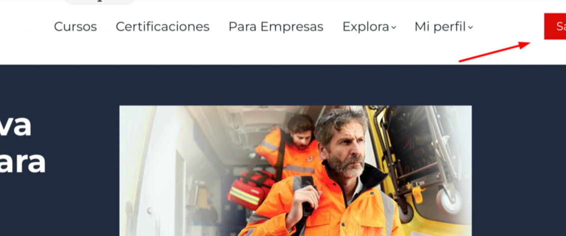
After sign in/up topbar
Before sign in/up topbar
Pop ups
Write your awesome label here.
Write your awesome label here.
Alignment - Responsive
About page
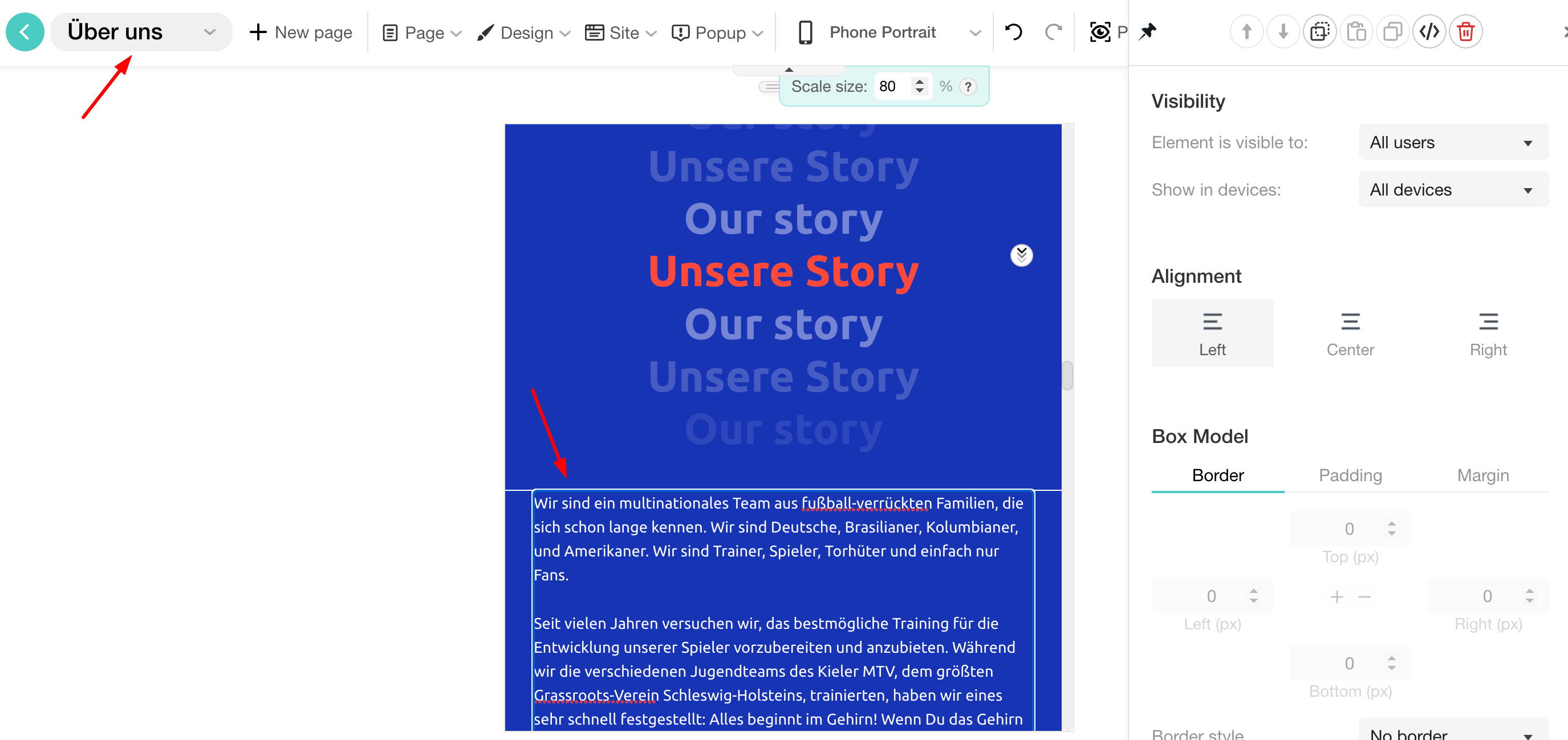
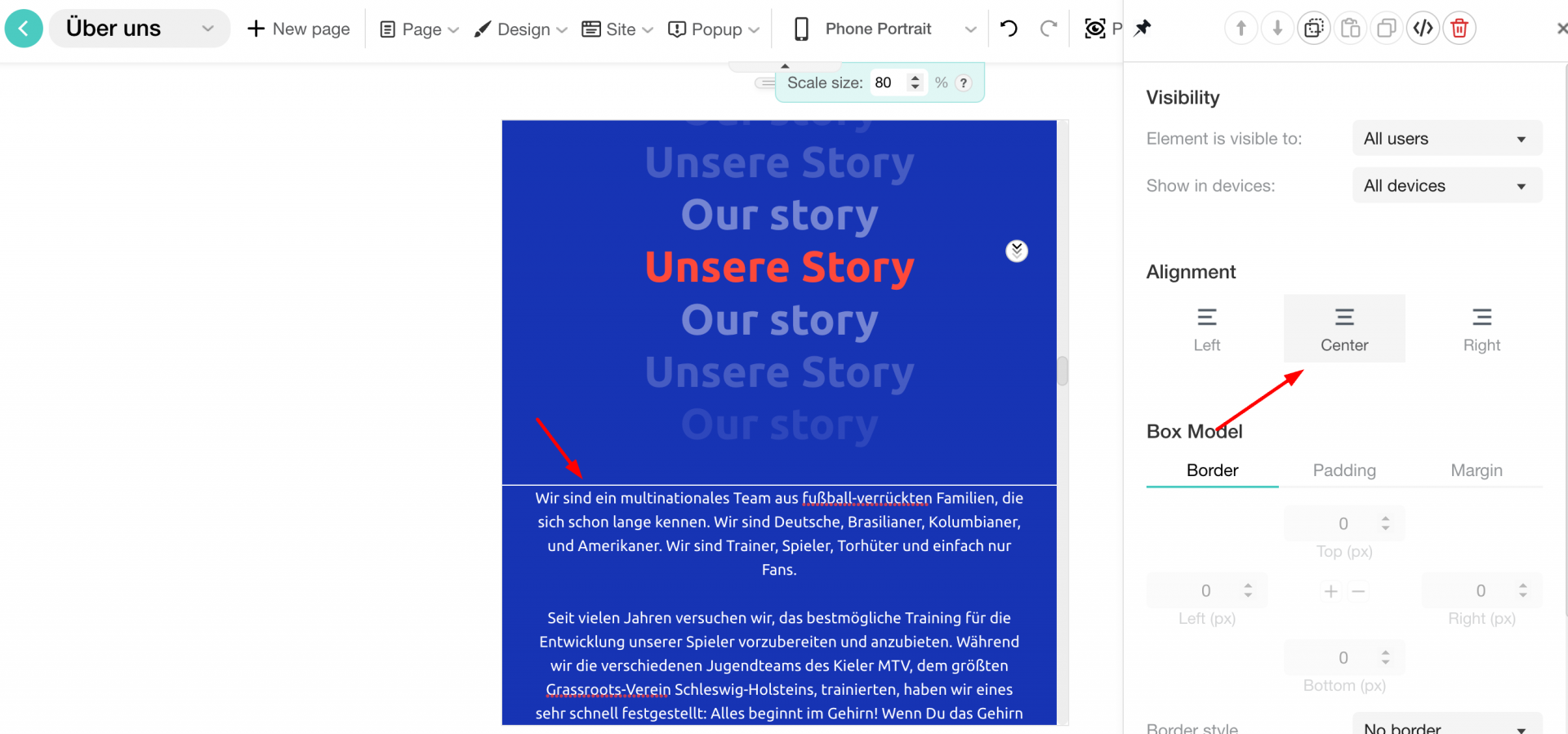
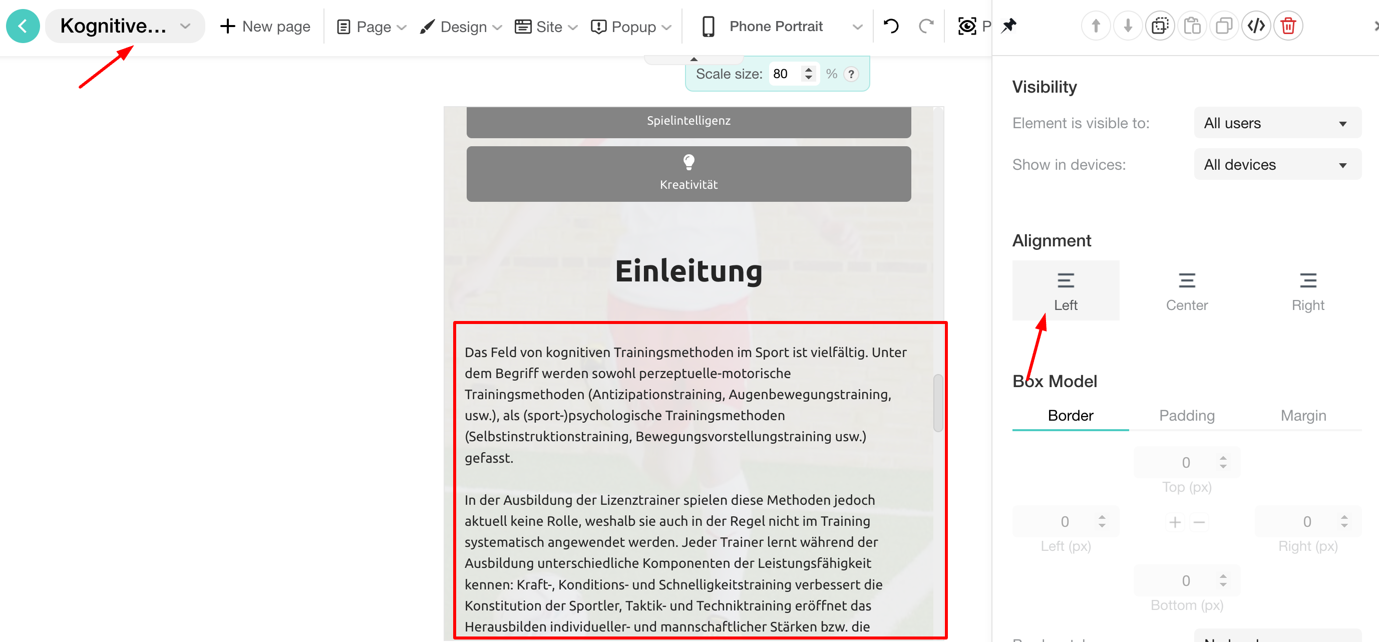
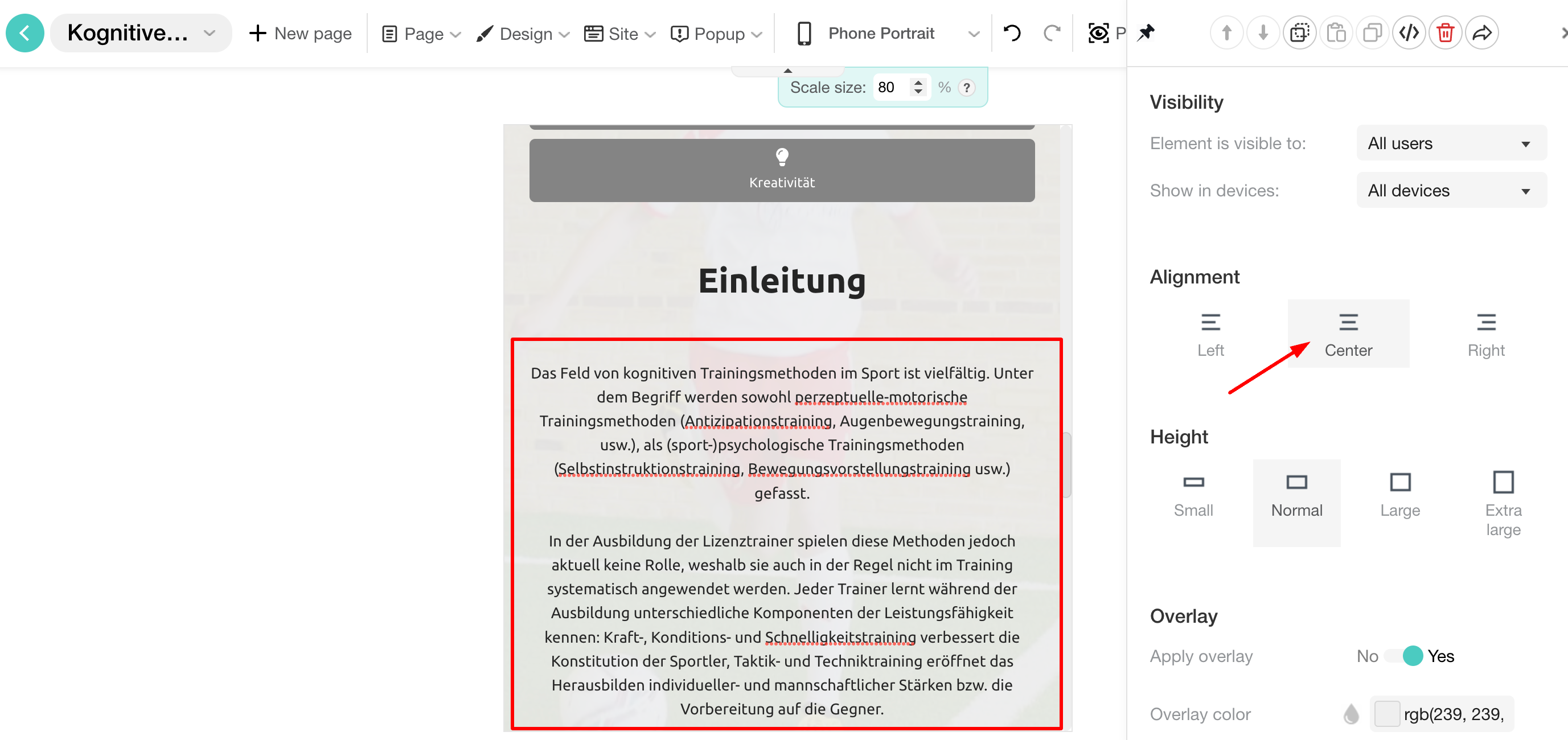
Alignment of elements
About page
Functional nurse academy course page
Home page
Spacing between elements
Home page
Home page
Access page
Functional Nurse Academy course page
Functional Nurse Academy course page
Practicioner Toolkit page
Grid columns - Layout
Directory page
Spacing between elements - Responsive
About page
Access page
Functional Nurse Academy (Spring 2024 Cohort) course page
Remnant page
Practicioner Toolkit page
General suggestions
About page
Functional Nurse Academy (June 2023 Cohort) page
Draft & Empty Pages
Topbar - Responsive
Fix:
Layout Suggestion
Step 1:
Step 2: